Sunday, 24 April 2011

Baroque: Who baroque the rules?

From the most previous class, we explored the world of the "baroquen". it is clear that the history has been repeating itself over and over again - one period of new invention of style then coming with it, the period of deformation, contradicting, rebelling the previous idea.


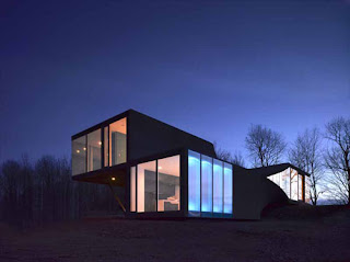
To clarify my statements, the first example would be Modernism and is enemy, Post Modernism. While Mies was experiencing the pure geometric forms made out out of the factory made materials- glass, steel, concrete and stucco, the UN studio broke the rule (international style) by creating Villa NM.


http://www.e-architect.co.uk/chicago/farnsworth_house.htm


http://archidose.blogspot.com/2008/02/un-studios-villa-nm-destroyed-in-fire.html


Absurdly, the form is an extruded box with twisted point in the middle and curved surfaces. Though, it is also wrapped with a taut skin like Mies's creations, the skin is made differently of earth -coloured spray- on concrete and mirrored glass.

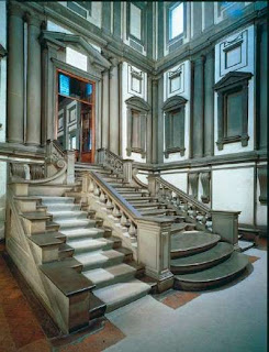
The similar way of rebelling is approached by Baroque architects- deriving from the disobedient thought of the new style, in this case, the Renaissance. On clear example is Bramente's Tempietto and Michelangelo's buildings. The perfect symmetry and the ideal depiction of Vitruvien ideology is baroque. There are uses of animated figures, bending and distorting of forms creating a play in perspective. Life is added in Michelangelo's architecture. Walls and facades became places for expression like the Church of St. Vincent for example.


http://www.vam.ac.uk/vastatic/microsites/architecture/style_level4.php?area=0&ext=.jpg&id=262&object=168&parent=257

http://entertainment.howstuffworks.com/arts/artwork/michelangelo-buildings6.htm

Sunday, 27 March 2011

Bigness or the Problem of Large- Rem Koolhaas

The growth of population, the higher demand, and the more advance of technologies - these perhaps are the main factors that help with the contribution of the bigness. The main problem occurring is perchance the lost sense of controlling through the process of expanding and adding of programs. The design becomes scarce. There is a change of the idea.Teamwork becomes an important word. The scale of the building is very big--so big that one can no longer does it alone as Koolhaas mentioned that "Bigness means surrender to technologies; to engineers, contractors, manufactures; to politics; to others.


From my point of view, the bigness idea when looking at it economically, it answers the need of the people. It provides space, the quantity that architecture cannot do (if architecture being the uniqueness in this case). There is no way that everyone is going to get one's own unit of living on the Earth surface. Not only the land price becomes way too high to afford (because small groups of rich people are holding the power), it in fact is just not possible. Quantity as a whole may then be the good answer for this push driven by the economic forces that causes the city to loose its control. But where is the value or merit of architecture? There are no longer homes for ones' own but a city within a city for ones to share. The individuality as well as the stardom perhaps can be seen as the inevitable victims who are being killed brutally.


"Bigness no longer needs the city: it competes with the city; it represents the city; it preempts the city; or better still, it is the city."


Frank Gehry and Expressionism

Flying through the architecture history timeline, our class has now landed on expressionist postmodernism where unusual massing, distortion of forms and symbolism are encouraged to create emotional effect and convey multiple meanings. The new movement also plays the same idea of forms follow function (modernism) but in a different sense. This time, the eyes of the beholders are not the architects but ordinary people (e.g. The Big Duck building is designed to be in a duck shape following its purpose of a duck selling house).


Among the famous expressionist postmodern architects, one very unique figure ,who interested me the most, was Frank Gehry. Personally, his fish series are distinctive and notable in term of the invention of idea and belief. His buildings stand out from their surroundings and draw people's attention.


http://www.eikongraphia.com/?p=50


However, in some project like "the Fish dance restaurant in Kobe, Japan" the 'too fishy' shape of it makes it look nothing more than an enlarged version of a well carved sculpture. It is just one big fish or in another word, it is unique but not intriguing. When compared to modernist buildings, it seems to have less thought and maybe too well-defined. If possible, I would rather prefer the new peculiar idea and concern of functions of Frank Gehry but the more abstract and logical forms of modernism plus the ambiguous meanings with numerous ways of understandings from post modernism.


http://latimesblogs.latimes.com/culturemonster/2009/03/video-frank-geh.html


Above is another Gehry's fish called the Vila Olimpica (Barcelona,Spain). This installation appears to be more attracting than the restaurant. I like the idea of how the fish is abstracted and becomes more open to interpretation. The form is more expressive, emotionally movable as it is subjective for the architect and also to the eye of viewers and it would be nice if this fish can actually becomes a living space.


‘It was by accident that I got into the fish image,’ said Gehry. ‘[In the Eighties] my colleagues were starting to replay Greek temples. That was hot, everybody was re-doing the past. I said, y’know, “Greek temples are anthropomorphic. And three hundred million years before man was fish. If you wanna, if you gotta go back, if you’re insecure about going forward, dammit, go back three hundred million years. Why are you stopping at the Greeks?” So I started drawing fish in my sketchbook. and then I started to realize that there was something in it.’


-Frank Gehry

Sunday, 20 March 2011

Post modernism

"Actual lie is the suggestion of truth."

The last two weeks we have been studying about high modernism and post-modernism. Personally I kind of like the idea of post-modernism more. Derived from a criticism of modern movement in architecture, it attacks the idea of how modernists believe in the definite forms and how they do not borrow anything from the past. Post-modernism somewhat presents a smarter thought. The fact that it has a more complex, open-ended meanings -which can be understood in many different ways -plus the assembling of the present, the past and the future united together. perhaps help to endure and lengthen its life on the fashion road. With this idea, it isn't in favour of one specific customer or one small group of people nor is it fixed in time and one interpretation. Since people's ways of understanding can change through time and according to their experiences, Post-modernism architecture then doesn't age with time. The creativity runs wider with the appearance of ornament and decoration, the play with pure forms and the obscure and uncertain meanings embedded behind it.

Michael Graves' work for example, it rejects the notion of the 'perfect' architectonic detail and play with all colors, methods, forms, materials available to architects. It does not have to be symmetrical which this gives interesting composition and shapes, making his buildings look unique and interesting than just following fixed forms.


NCAA Hall of champions

http://en.wikipedia.org/wiki/File:NCAA_Hall_of_Champions.JPG


Sunday, 6 March 2011

PlayTime

One aspect of modernism viewed by the movie Playtime is the idea of conformity and dehumanization. Buildings and each unit in the buildings are shown to be indistinguishable with cubic shapes and straight lines, built with glass and steel.

wikipedia.com

People are conformed with similar kind of clothes, also with limited colour choice and tones. Shades of grey, blue, black and grayish white are predominant. Not only it homogenizes the people, it gives a dull machine look. In the movie, there's a scene showing that people look too much alike that they get called for wrong names

sensesofcinema.com

The dehumanization idea is shown mostly by the people's behaviours, for example, how they respond to time and the relationship between one another. In one beginning scene, people walk straight lines and turn on right angle. This robot manner presents how people are becoming less human like. Only construction workers and music lovers in the movie walk freely and naturally. This perhaps raises another discussion for class and rural v.s. urban (free v.s. conformed).
One of the main character, Monsieur Hulet is possibly the representation of the rural and 'us' the audience at that period of time. His character helps us see the futuristic world and the coming changes in a wider perspective as an outsider who steps back a bit and watch what was actually going on. Anything new or unnecessary in the modern society is seen as obstacles. Others (modernist people) are portrayed in a weird sense and lifelessly, noting that the freedom, the living are the noncomformity, the messiness and the human nature.

Sunday, 20 February 2011

Mies Van De Rohe

Mies Van De Rohe vs. Tadao Ando (Barcelona Pavilion vs Azuma House)


Continuing on modernism study, this week we focused on Mies Van De Rohe. One of the most famous work of Mies is the Barcelona Pavilion. The pure simple structure reminds me of a building called Azuma House in japan (Tadao Ando) from my architectural design class. Some of the sameness found in the two buildings is firstly the modern vocabulary embedded. They both have a simple geometric structure. Barcelona pavilion has straight lines and cubic forms with no curves. Azuma house also, no curves has straight lines and a rectangular form.


http://www.democraticunderground.com/discuss/duboard.php?az=show_mesg&forum=105&topic_id=9167050&mesg_id=9167060

http://www.arcspace.com/books/Minimalist_Architecture/minimalist_book.html

The two buildings, one for exhibition and another a s a residential unit, make use of walls. For Mies, the walls direct visitor movement , creating continuous turnabouts, not a straight line circulation. They are used to create narrower and wider space for people to experience. While for Azuma house, Ando believed that the walls are one of the very powerful tool of division. They are used to divide space and for that sake only.


The main difference of the two buildings is the materials. Barcelona Pavilion uses exotic luxurious materials like marbles and travertine. They are well-polished. The patterns on those materials are used as spatial divider and help with directing movement. In contrast, Azuma house uses a cheap manufactured material like pre-fabricated concrete, not polished to present what they truly are (real nature of material). So if it is to conclude, the materials for the pavilion are used mainly to direct people whereas for Azuma they are used to present the concept of getting in touch to the real nature. However, the two purposes are under the same modernist idea of using the materials themselves as ornaments (beautiful patterns- Barcelona Pavilion and natural beauty-Azuma).


http://www.democraticunderground.com/discuss/duboard.php?az=show_mesg&forum=105&topic_id=9167050&mesg_id=9167060

http://www.architravel.com/architravel/building/134

Furthermore, for the overall sense of openness, Barcelona pavilion is a vast open space while Azuma is an enclosed space(concrete box) which create a sense of privacy for residents who live in the busy town. The Barcelona pavilion looks as simplest as it can be with that minimal design of no enclosed wall or a clear hole for entrance. Azuma in the other hand, although the whole site is surrounded by thick concrete box, in the inside the selection of materials, together with the natural lighting effect, wider and emptier space is created (illusion to the eyes).


Lastly. the two building have similar kind of peaceful atmosphere they want to create using natural elements as tools. The Barcelona Pavilion uses water and stone to help create an ideal zone of tranquility. Azuma House uses natural materials like slate and stone along with the open courtyard design to have people get close r to nature which would eventually make them realize the hard ship of life and have a zen mind.


http://lab.visual-logic.com/academia/la-2101-advanced-digital-representation/project-2-0-objectdevice/
http://www.cgpinoy.org/t11809-azuma-house


Sunday, 6 February 2011

Le Corbusier and Modernism

This week in my history lecture class, we continued our journey on modernism, mainly focused on Le Corbusier and his work. As modernism emphasizes on revealing the truth, honest use of materials is one of the key. "Mass and surface are the elements by which architecture manifests itself" (Corbu) Buildings' facades are nothing more than walls with holes. One of Le corbusier's design, Unite de Habitation has the entire exterior built with concrete. Noting is polished so nothing can be concealed.


Unite de Habitation
http://commons.wikimedia.org/wiki/File:Briey_unite_d_habitation.jpg


His work is functionalist and socialist (influenced from the current situation/social system at the period of the time), only emphasizing on how how things cam be used. Anything which is not necessary will not be included in his design. For example, his roof has to be flat not only because it is a clean simple design but it also carries another task which is to serve domestic purposes like gardening or relaxation.


Villa Savoye's roof
http://www.mimoa.eu/projects/France/Poissy/Villa%20Savoye


His pilotis are as smallest and slenderest possible. Furthermore as mentioned before that his work is also socialist, Corbu tried to establsh some kind of a new idea to change human living behaviour. Unite de Habitation is identicle on the outside. Every unit is equal on the inside. Corbusier's support system, the pilotis, have to be spaced out regularly and precisely calculated.


Economically and theoretically the idea works. It probably worked so fine at that moment (after WWI and during the great depression decade). The least amount of material use helped save the cost, making housing affordable. Environment and surroundings have effects on people's behaviour. So by making everything equal and the same, personally, even though it looks clean and organized but it was too ideal. Take La Defense for example.


La Defense
http://www.volker-goebel.biz/LaDefenseLeCorbusier.html


Though it creates (or forces) a sense of community and clear functional zoning, the high rise blocks for me almost anonymized the residents. Basically his design did not reduce only materials structure or the overall design but perhaps it reduce d human's value and freedom also. In fact coming to think about the whole city turning into the Unite de Habitation, I see the new issue of boring cityscape which might tire people's eyes. Lastly, the material use, because it was the 'simple clear minimalist' design with concrete and glass which is meant to reveal the truth (only?), the units weren't comfortable to live in (thermal comfort).